CMYK and Pantone in Paper Packaging
Color is one of the most powerful elements in packaging design. It not only attracts consumer attention but also strengthens brand identity and influences purchasing decisions. When it comes to printing on paper packaging, two main color systems dominate: CMYK (Cyan, Magenta, Yellow, Black) and Pantone Matching System (PMS). Understanding their differences is essential for achieving the desired visual effect, controlling costs, and ensuring brand consistency.
What is CMYK Color?
CMYK stands for Cyan, Magenta, Yellow, and Black (Key). These four colors are combined in varying percentages to create a wide spectrum of tones. It is a subtractive color model, meaning that colors are created by subtracting light reflected from a white background.
In packaging printing, CMYK is highly versatile and cost-effective, especially for projects that involve images, gradients, or a wide variety of colors. Since most digital and offset presses are designed for CMYK, it is considered the standard in commercial printing.
However, CMYK does have limitations: not every shade can be perfectly reproduced. Bright neon colors, metallic tones, and some brand-specific shades may appear duller or slightly different from the intended design.

What is Pantone Color(PMS)?
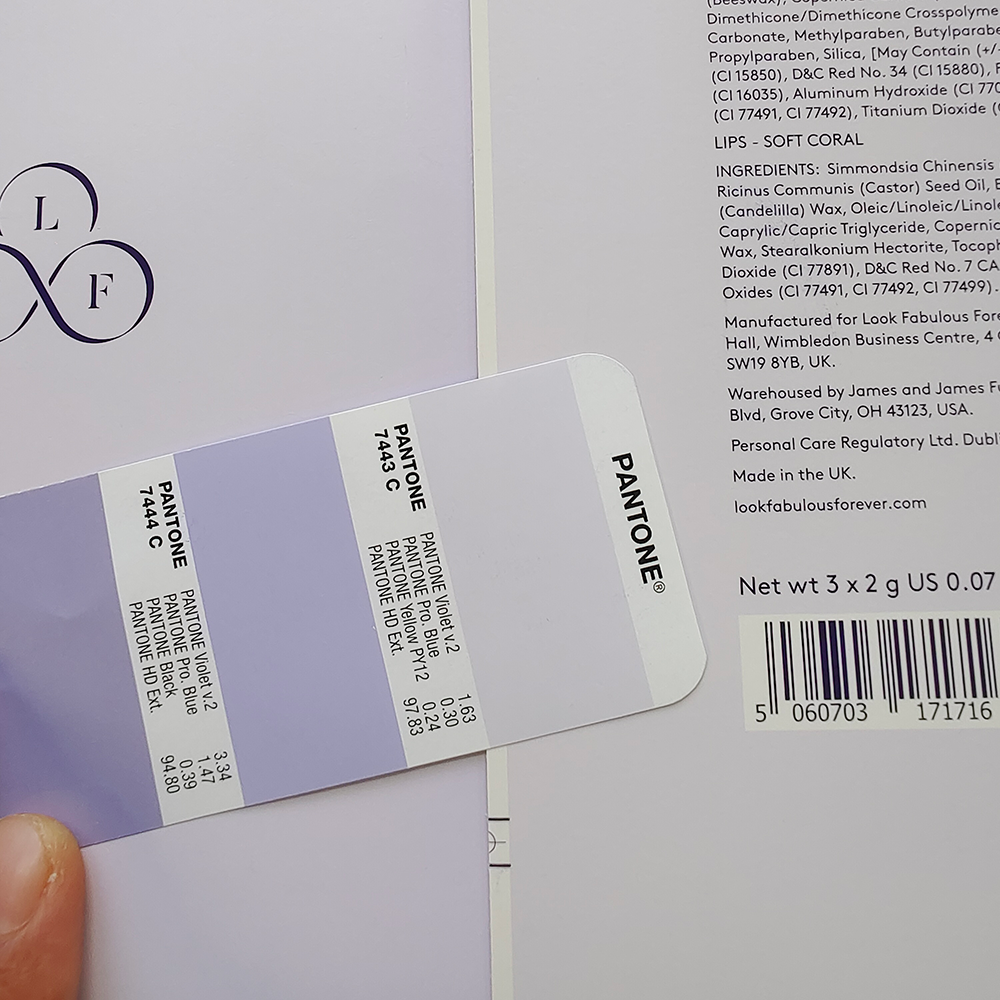
Pantone Matching System (PMS) uses pre-mixed spot colors that are created according to standardized formulas. Each Pantone color has a unique reference number, ensuring that the same color can be consistently reproduced, regardless of printer, location, or material.
Unlike CMYK, which blends inks during printing, Pantone colors are applied as single, solid inks, which makes them more accurate and vibrant. For this reason, many brands with strict identity guidelines insist on Pantone colors to guarantee consistency across packaging runs.
According to Pantone’s official guide on color spaces, spot colors are specifically designed to deliver consistency where CMYK simulations may fail. This is why Pantone is often the preferred choice for logos, brand elements, and luxury packaging that require precise visual impact.

CMYK and Pantone in Paper Packaging: Key Differences
| Aspect | CMYK Printing | Pantone (PMS) Printing |
|---|---|---|
| Color Creation | Mix of four inks (cyan, magenta, yellow, black) | Pre-mixed, standardized solid inks |
| Color Range | Wide spectrum but not 100% precise | Exact shades, including neons & metallics |
| Consistency | Can vary between printers/materials | Highly consistent across different printers |
| Best For | Photographic images, full-color graphics | Solid brand colors, luxury packaging |
| Cost | More economical for multi-color printing | Higher cost due to custom inks |
| Printing Setup | Uses standard 4-color process | Requires additional plates for each color |
Choosing Between CMYK and Pantone
- When to use CMYK:
- Multi-colored packaging with complex images or gradients
- Cost-sensitive printing projects
- General retail packaging
- When to use Pantone:
- Logos, brand marks, and corporate identity
- Packaging that requires exact color matching
- Premium or luxury packaging with high visual demands
Pantone has also developed updated tools for designers and printers. The new CMYK guide expands the available color range and enhances consistency, giving packaging professionals more flexibility in balancing cost and accuracy.
Printing Requirements and Considerations
- CMYK Printing: Most offset and digital presses are optimized for CMYK. Setup is straightforward, making it suitable for fast, large-scale production.
- Pantone Printing: Requires additional plates and inks, which can increase costs and production time. However, it ensures precision and consistency, especially for global brands.
Final Thoughts
Both CMYK and Pantone play important roles in packaging design. CMYK offers flexibility and efficiency for everyday printing needs, while Pantone ensures unmatched accuracy and consistency for brand-critical elements.
For businesses, the choice depends on budget, design requirements, and how important color consistency is to the brand. In many cases, designers use a hybrid approach, applying CMYK for images and Pantone for logos or key brand colors.
By understanding the strengths of each system, packaging professionals can make informed decisions that balance cost, quality, and brand integrity. method to achieve their desired results—whether that means cost-effective CMYK production or Pantone printing for consistent brand colors.
FAQ: CMYK and Pantone in Paper Packaging
Q1: What is the main difference between CMYK and Pantone in packaging printing?
A: CMYK is a four-color process that blends cyan, magenta, yellow, and black inks to create a wide range of colors, while Pantone (PMS) uses pre-mixed spot colors with unique codes for precise color matching. CMYK is versatile for images and gradients, whereas Pantone is preferred for brand logos and exact color consistency.
Q2: Why do brands often choose Pantone colors over CMYK?
A: Brands choose Pantone because it guarantees consistency across different printers, materials, and regions. Pantone spot colors ensure that a logo or brand shade looks the same on every packaging batch, which is difficult to achieve with CMYK alone.
Q3: Is Pantone printing more expensive than CMYK?
A: Yes. Pantone requires additional spot inks and sometimes extra printing plates, which increases cost. CMYK is more economical for full-color printing, while Pantone is worth the investment when precise brand identity and luxury appeal are essential.
Q4: Can CMYK and Pantone be used together in packaging?
A: Absolutely. Many packaging designs use CMYK for images or background graphics and Pantone for logos or key brand colors. This hybrid approach balances cost efficiency with color accuracy.
Q5: Which system should I choose for my packaging project?
A: If your packaging includes photos, gradients, or large-volume printing, CMYK is usually the best option. If your brand demands precise, consistent colors across global markets, Pantone is the safer choice.
📩 Let’s talk about your project today and make beautiful packaging products


